Baresticks Popsicles
Visual identity for a popsicle brand delivering both purity and participation
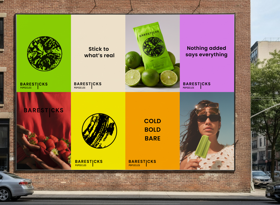
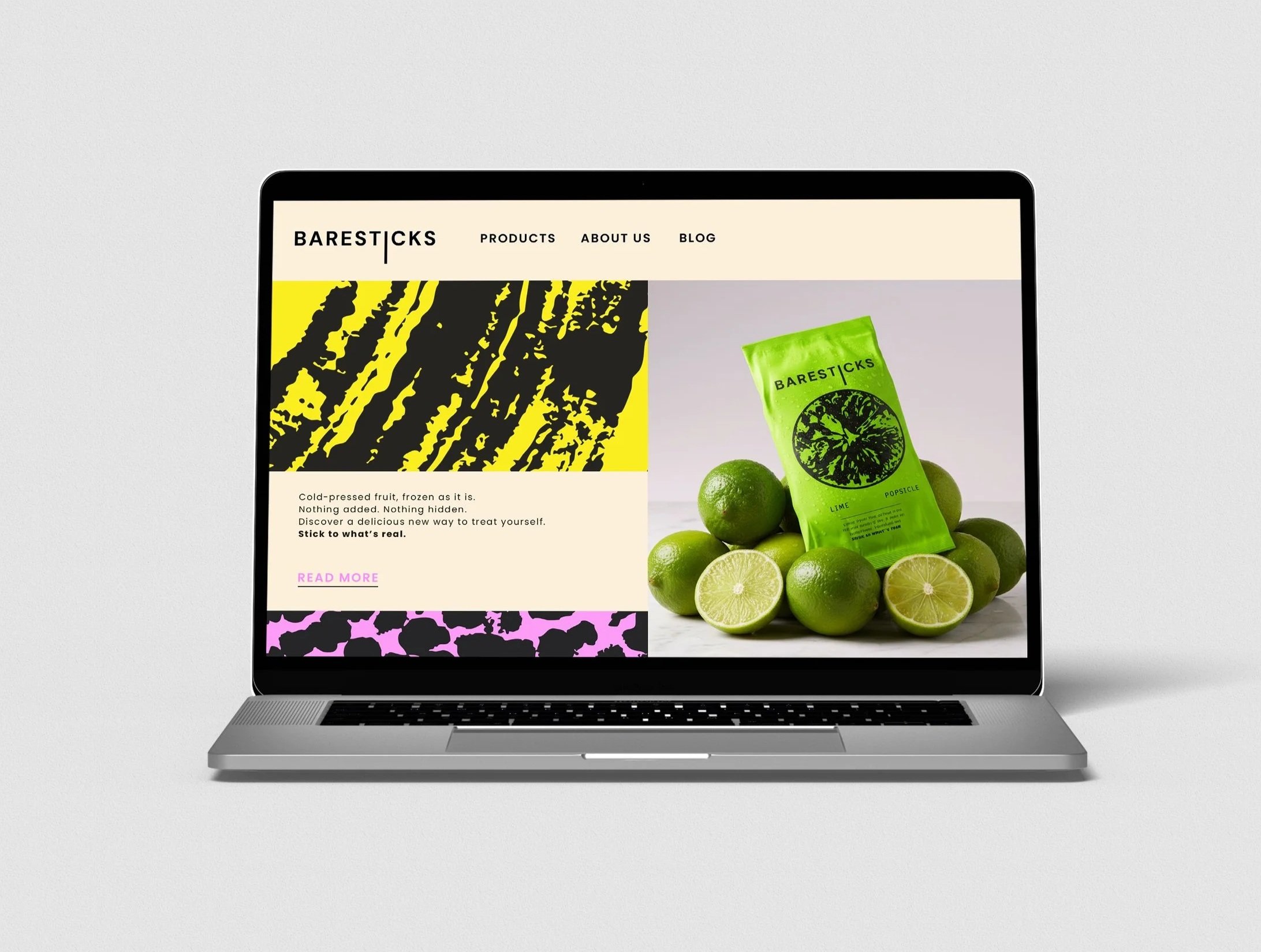
Frozen fruit is one of the fastest-growing snack categories, yet the UK market often splits between fun and health. BareSticks Popsicles brings the two together, a brand built on purity and participation.
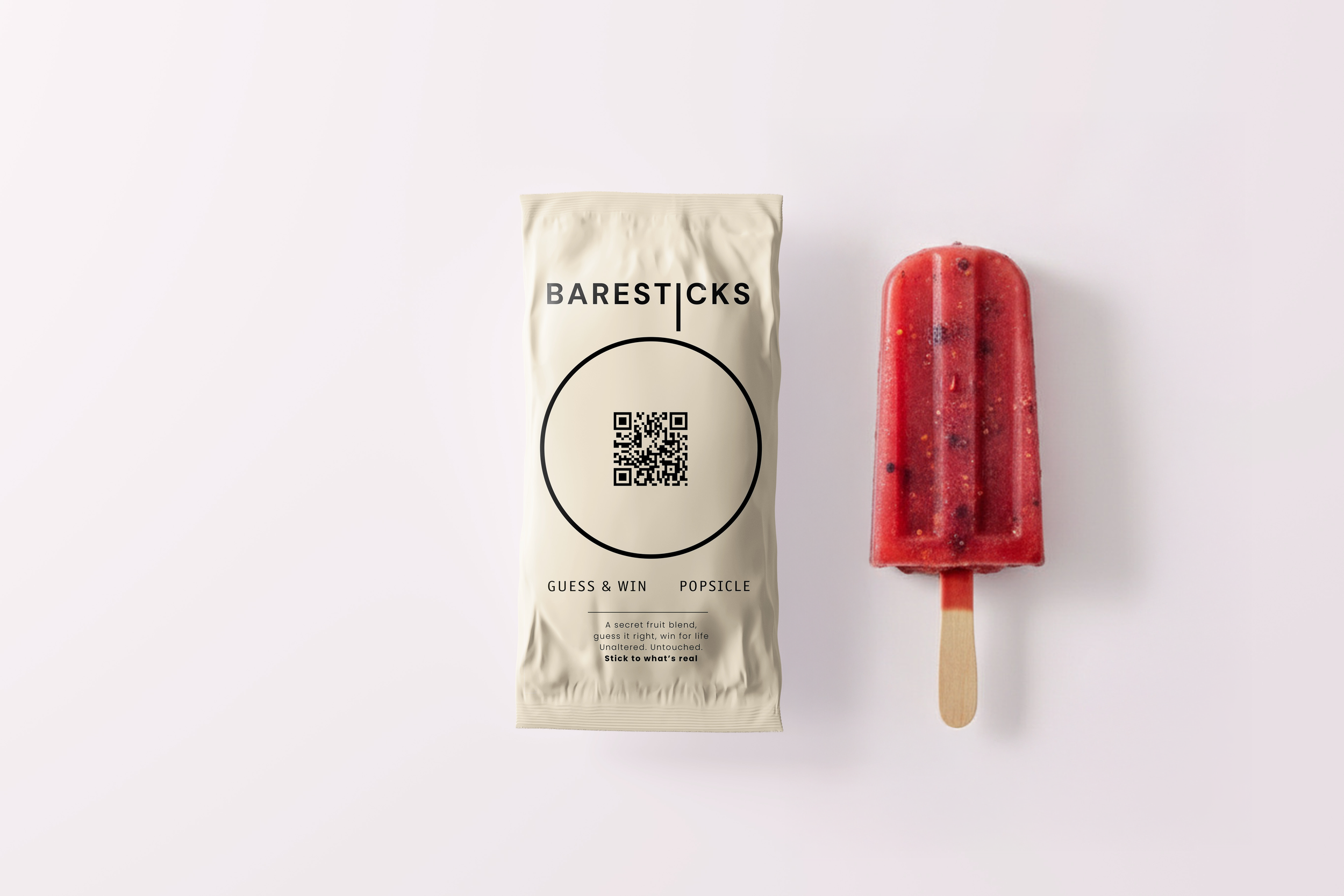
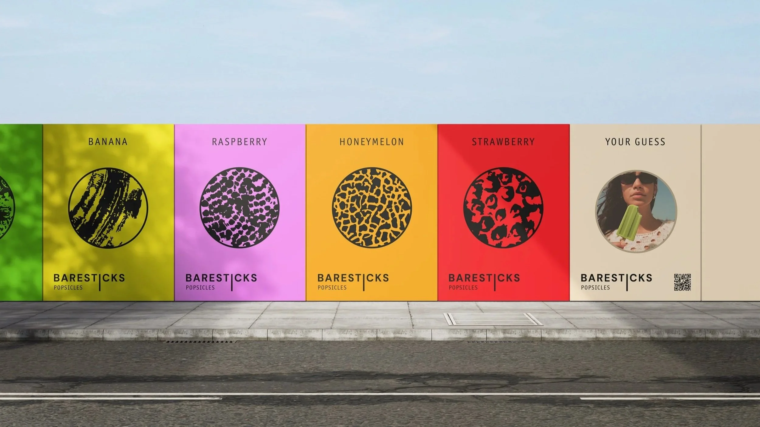
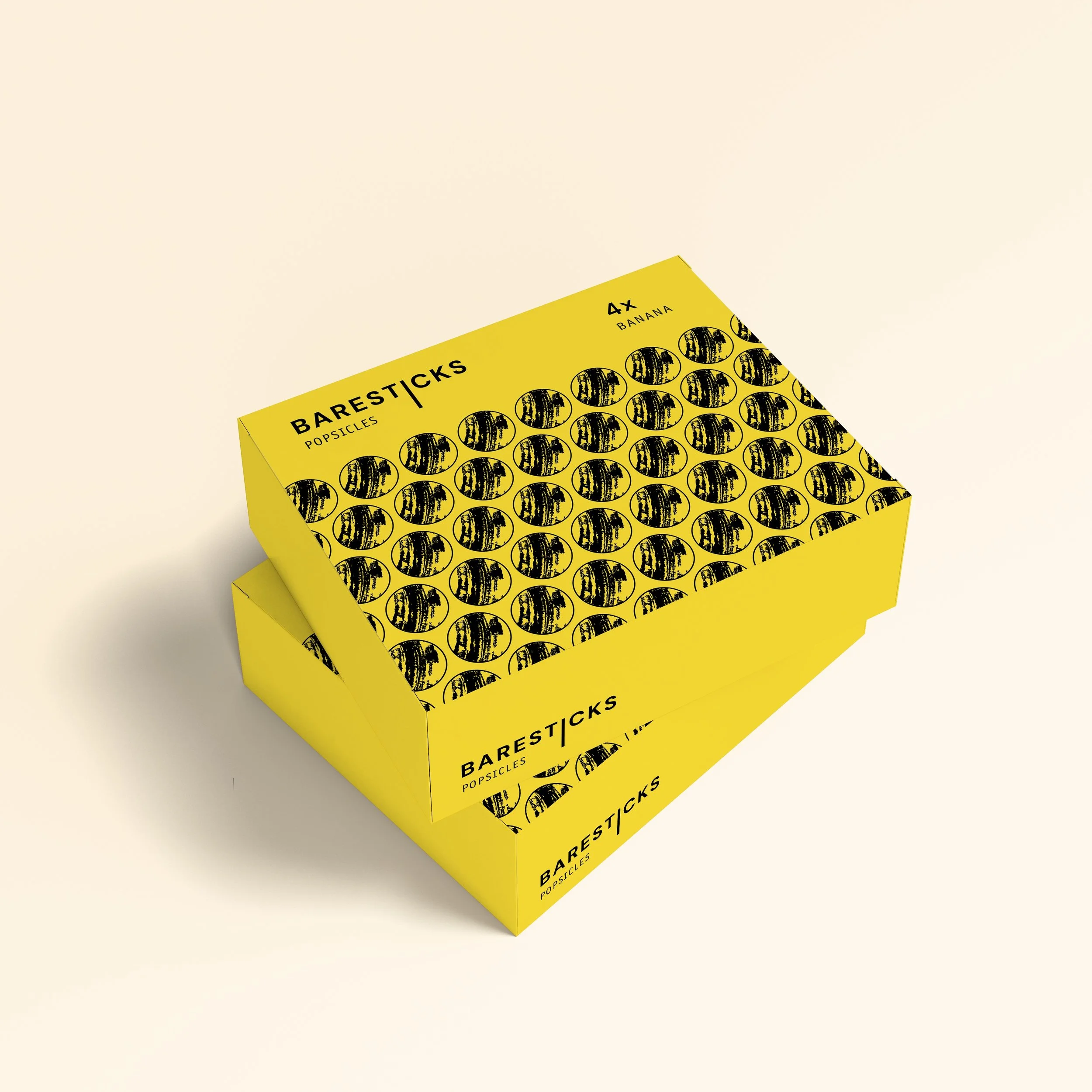
Its pattern identity is stamped using real fruit skins, making honesty visible through design. Alongside core flavours like strawberry and banana, a mystery blend invites people to guess and share the ingredients, placing Gen Z’s curiosity and interaction at the heart of the product.
The brand is scalable with a conglomerate like Nestlé, yet appears independent.
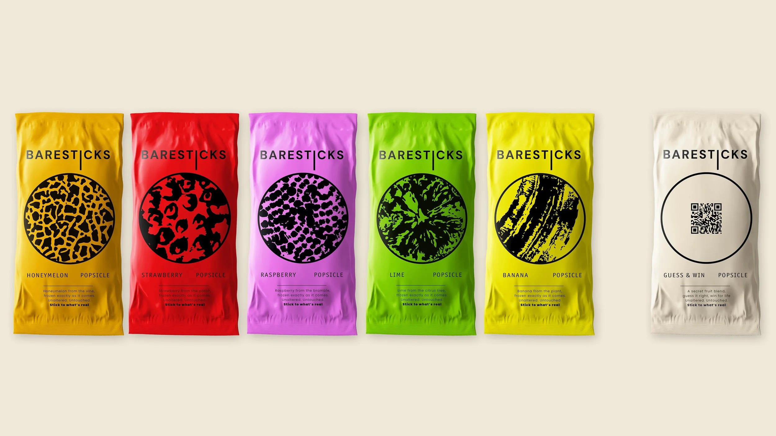
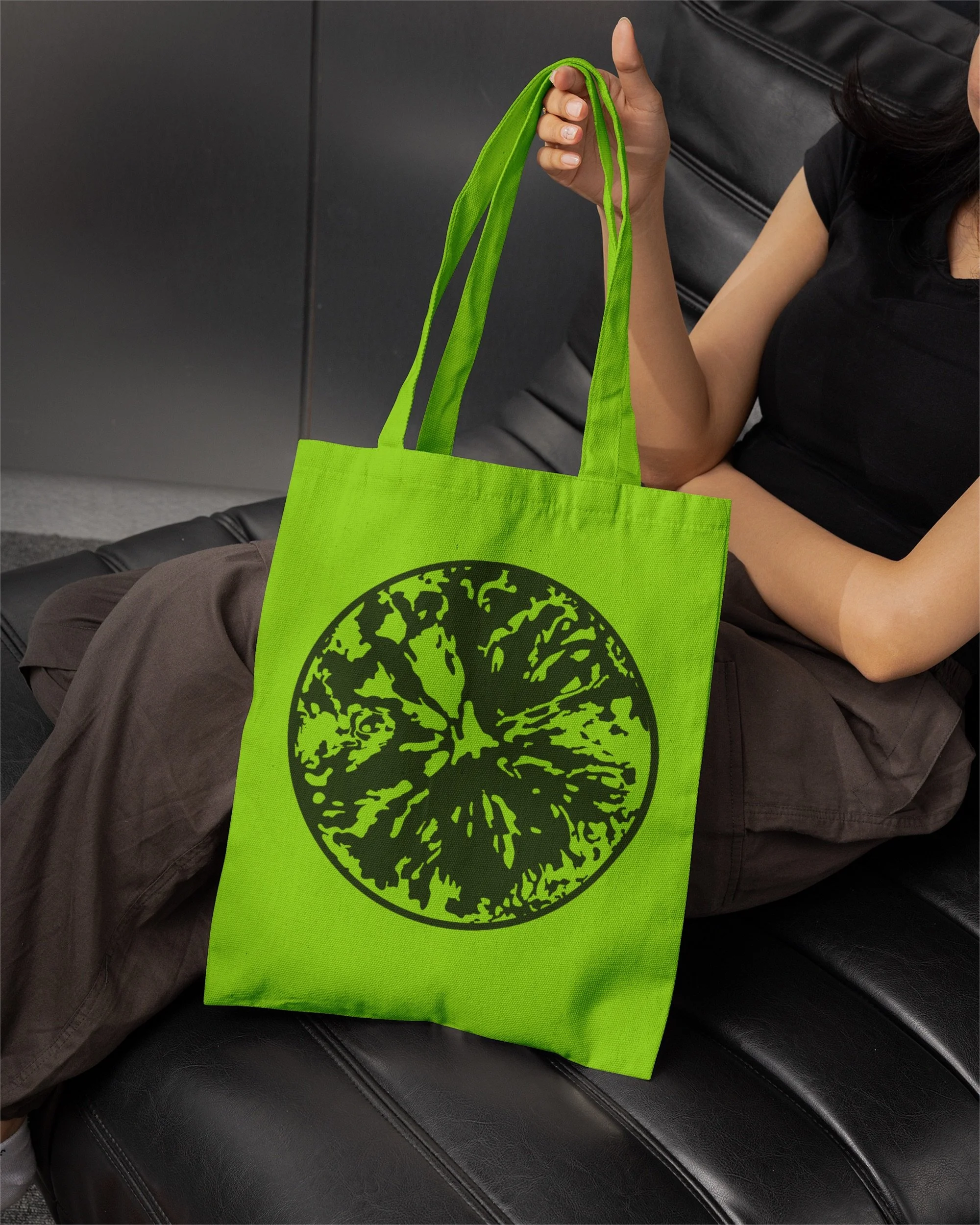
A fruit-stamped globe symbol signals natural sourcing.
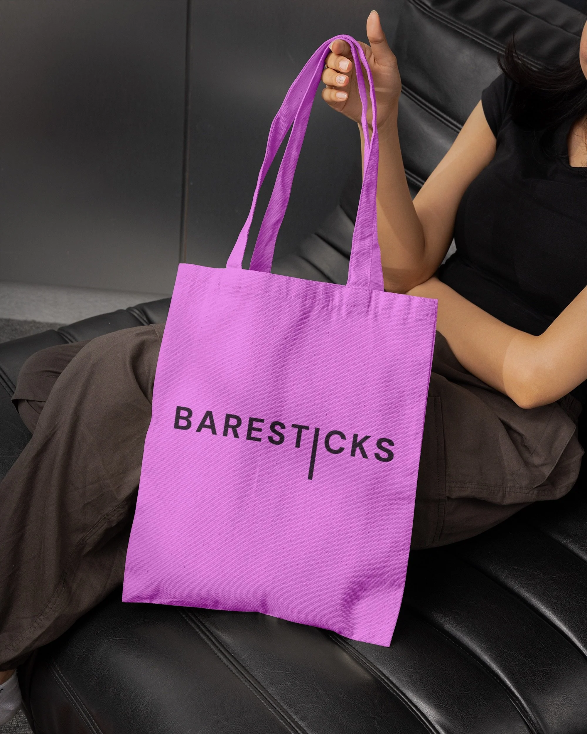
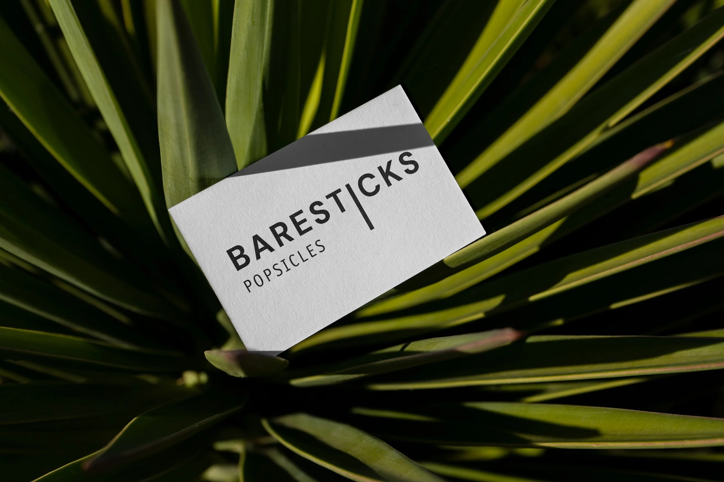
The long “I” in the wordmark mirrors a popsicle stick.
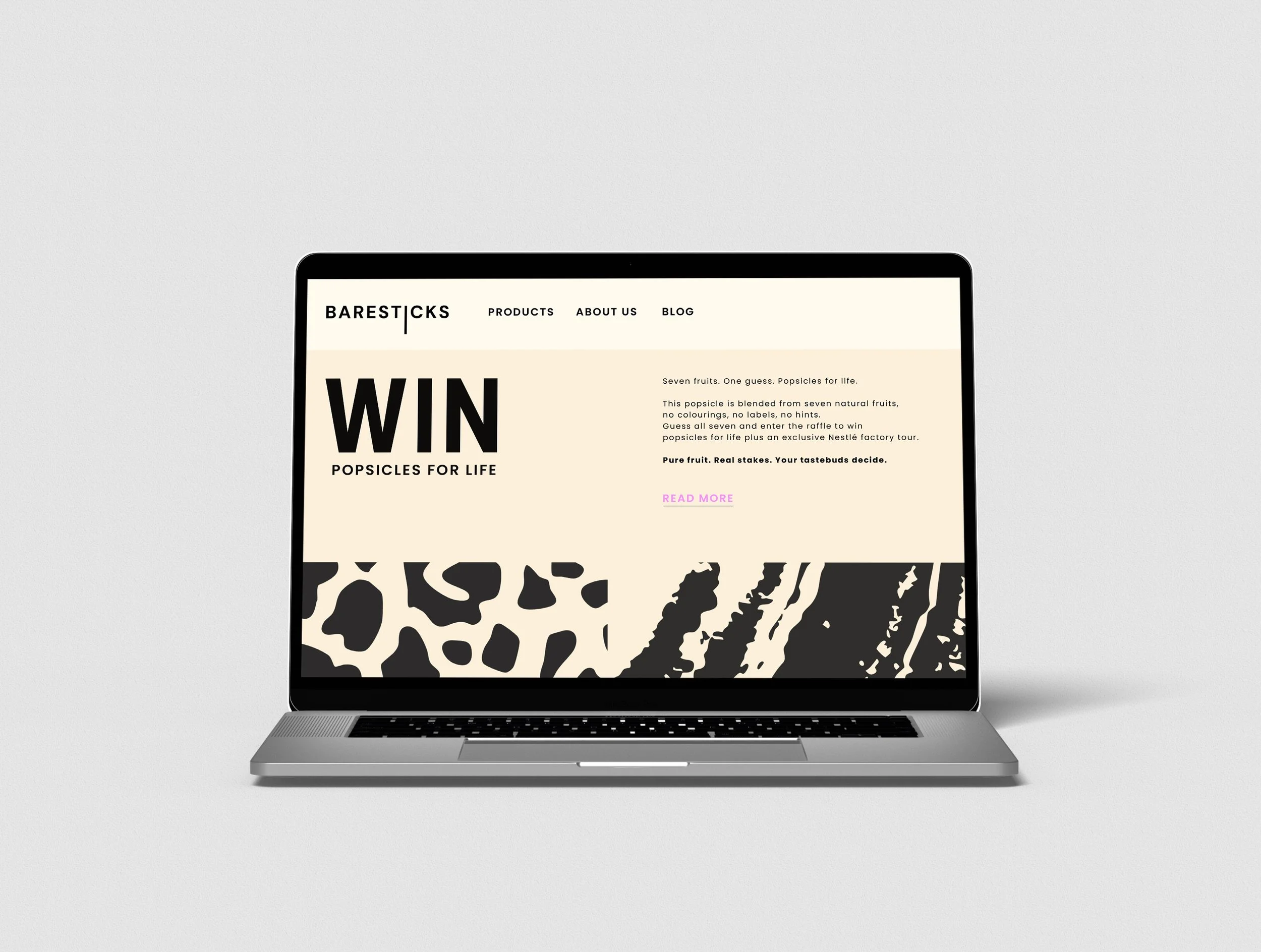
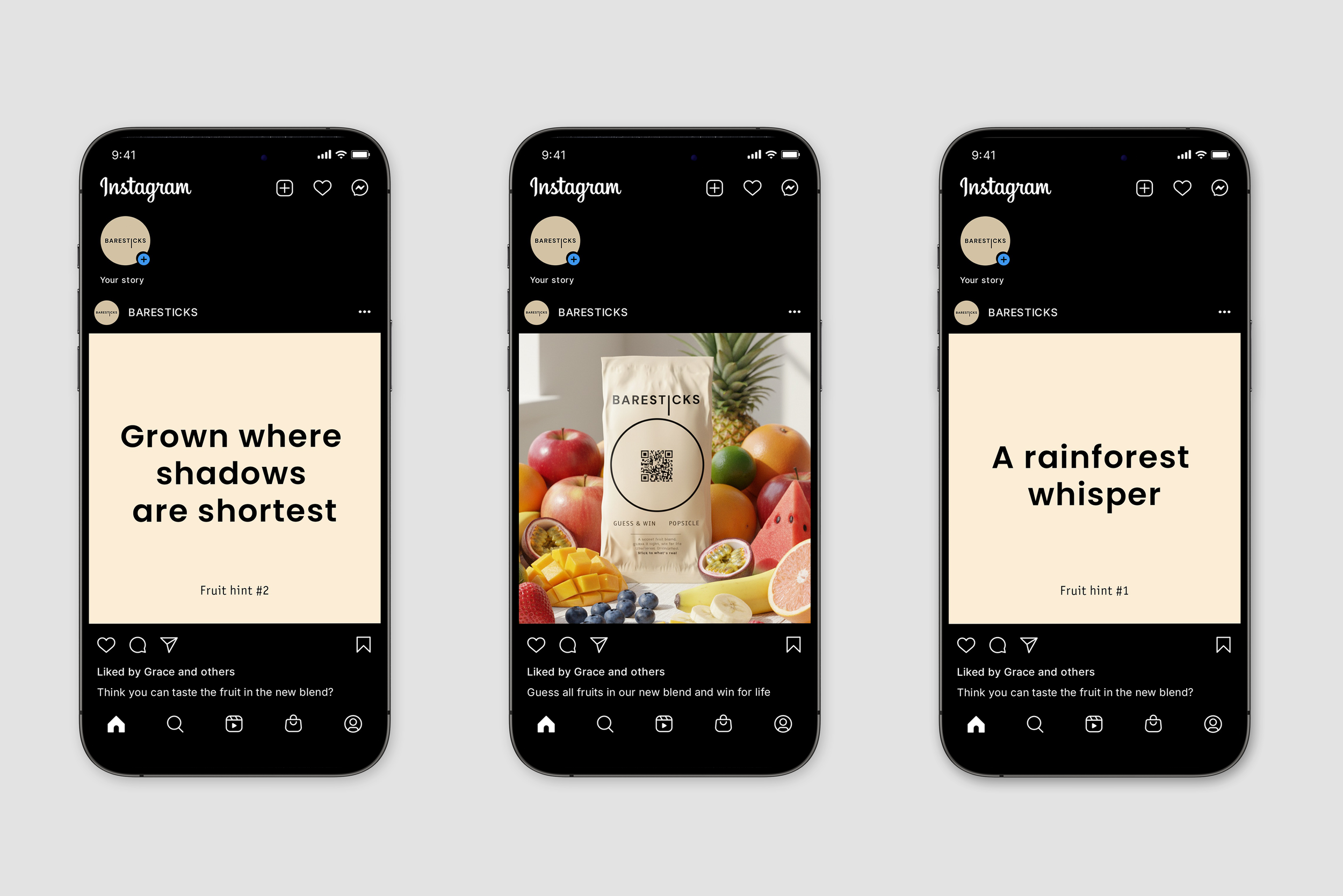
The brand launches a mystery blend with hidden ingredients.
A QR code on the pack links to a guessing site, with hints shared on social media.